Example 1


Terri Sjodin
Task was to create a Manuscript
Time Length was 6 weeks with multiple projects being completed simultaneously
Unlike creating a regular book - a manuscript is meant to stay quite simple and easy for publishers to preview before any actual design choices. In Terri’s case we immediately switched aesthetic once we received the first publisher. The design direction shifted into a more professional look with sheriff fonts, strict typography, and full usage of the black and white restriction
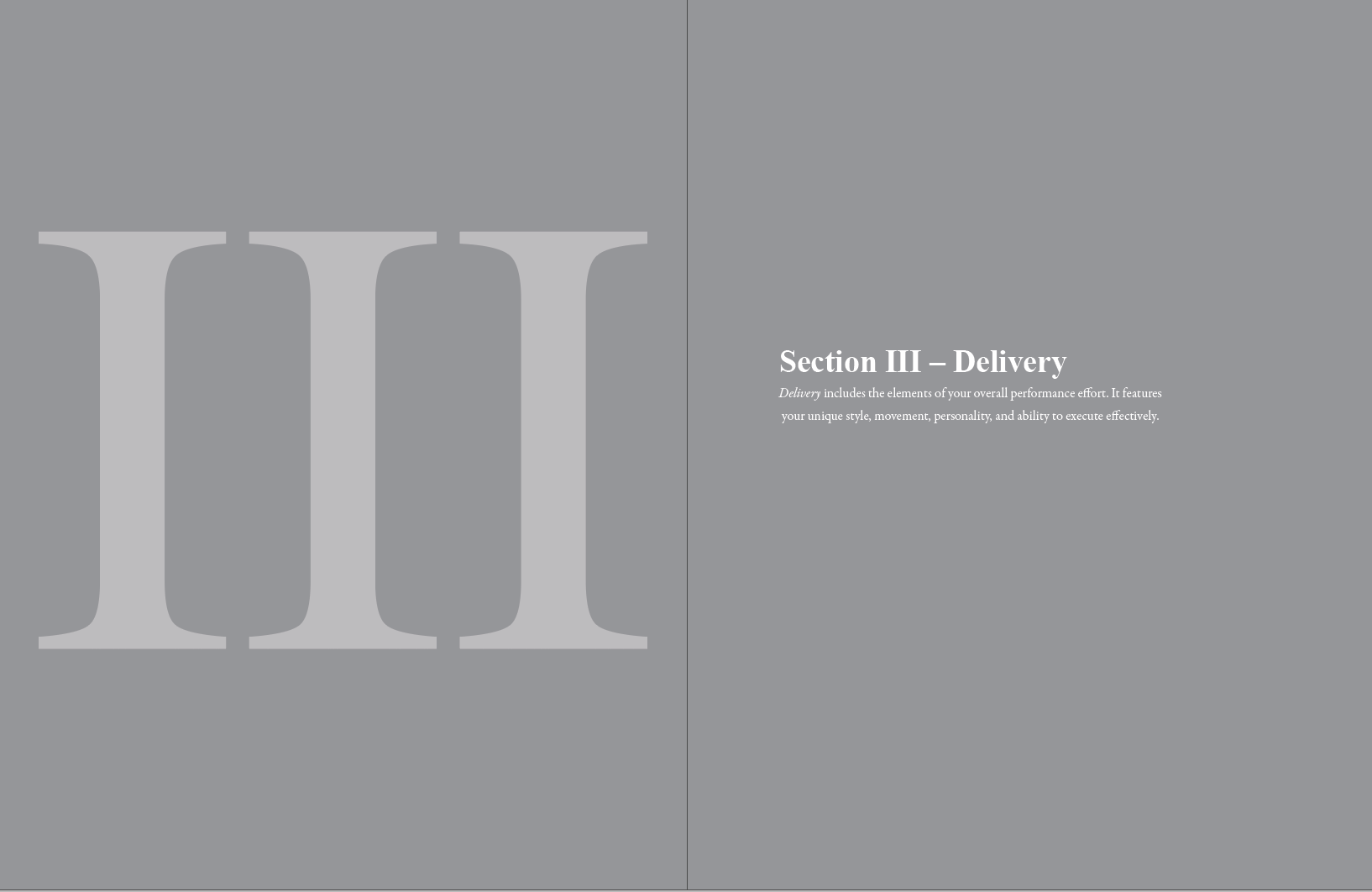
Section Separators, Chapters, Acknowledgments, Table
of Contents, Hierarchy, Forms, and Character styles were all parts of the manuscript I had to take account for.
The “boundaries” or rules were to only use black and white. My work around to create depth in our typography system was using Size, Opacity, and Negative Space.
Typography
A combination of DIDOT, GARAMOND PREMIER PRO, AVENIR, and AMERICAN TYPEWRITER was used to create this masterpiece of a system.
References used were prior books of Terri -
Didot and Inter were the fonts of choice. The design direction was to be easy to read and have an “elegant” aesthetic.

Report 3
This book was created throughout a series of studies on sales presentations.
Each report has its own physical and online version for the public - each being designed. The task was to create the last report following guidelines of the last two designers.

Pages from the 18-page report
Including graphs, imagery, covers, and call outs