
CONCEPT
Currently, El Torito seems very gloomy and bar-like, which is certainly a great thing if you want a bar to go drink your sorrows away ,but that’s not what the restaurant deserves or represents.
The chain of restaurants is located in Orange county where the clientele is lively, predominantly white families. Knowing who our demographic is catering brings the amazing opportunity to rebrand. Simplifying the color palette to seem more uplifting, adjusting the wordmark to be more open and friendly, and even the interior to a more eco-friendly environment yet still having a family-friendly Hacienda vibe - El Torito.

The Design Direction I chose was strongly inspired by the old El Torito Logos. They each were very bold and strict, they felt traditional and fierce. The new hand-drawn logo is meant to feel more welcoming and playful. Unlike its predecessors, the type feels fluid while still maintaining composure.

INITIAL DIRECTIONS
The two directions shown portray two very different aesthetics and both are too outgoing. The current solution combined these ideas into a festive yet firm design direction inspired by the restaurant’s music choice.


The colors were inspired by Marigolds while the Patterns from traditional Mexican dresses and art. Marigolds are iconic - these are the flowers used in mexican holidays. seeing them makes people feel happy and joyful, that’s vibe the restaurant desperately needs.


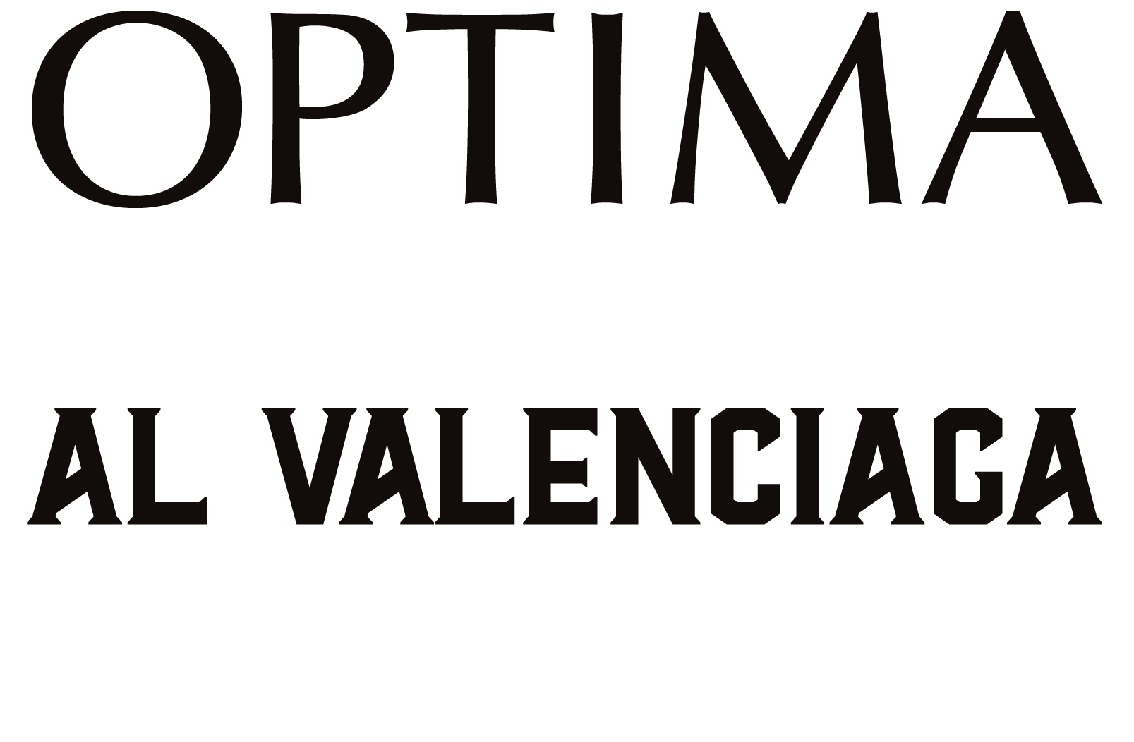
WORDMARK
A hand-made word mark created with the intention of feeling friendly and open.

TYPOGRAPHY


PATTERNS

COLORS

PERSONAS
SIGNAGE + SOCIALS


COASTERS + MENU


APPAREL
Restaurants uniforms are always
better in black - the less mess you see.
The subtle texture adds detail
and still feels festive - reflecting
the desired aesthetic.

